Complementary colors, also known as contrasting colors, refer to two colors that are positioned opposite each other on the color wheel. When these colors are placed side by side, they create a striking visual effect that captivates the viewer's eye. An exemplary illustration of this phenomenon can be observed with the combination of orange and blue, which together form a visually compelling harmony.
To understand complementary colors, it is essential to grasp the concept of the color wheel, which organizes colors into primary, secondary, and tertiary categories. The primary colors, namely red, blue, and yellow, serve as the fundamental building blocks from which all other colors are derived.

By skillfully blending these three primary colors, a diverse spectrum of shades can be achieved. Secondary colors, on the other hand, are formed by mixing two primary colors together. The three secondary colors are green, orange, and purple. Finally, tertiary colors emerge from the fusion of primary and secondary colors and are positioned between the primary and secondary colors on the color wheel.
When complementary colors are placed in close proximity, their stark contrast generates a visual impact due to their opposite placement on the color wheel. This contrast intensifies the individual hues, rendering each color more vibrant and captivating to the observer.
However, it is important to exercise caution when utilizing such contrasting colors, as an excessive and unbalanced application may lead to a visually jarring composition. A well-executed approach involves employing a contrasting color as an accent within a composition. Striking a balance is crucial; an equal distribution of both colors could result in a chaotic-looking piece of art. Therefore, it is recommended to use complementary colors strategically and judiciously.
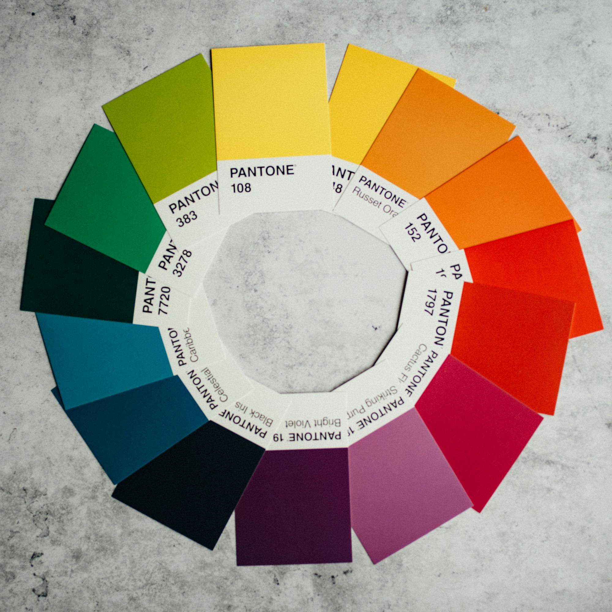
Examples of complementary color pairs include red and green, blue and orange, and purple and yellow. When these contrasting colors are mixed together, they tend to neutralize each other, resulting in beautiful shades of grey. These nuanced tones can be skillfully incorporated into paintings to add depth and visual interest.
Some of my favorite combinations are:
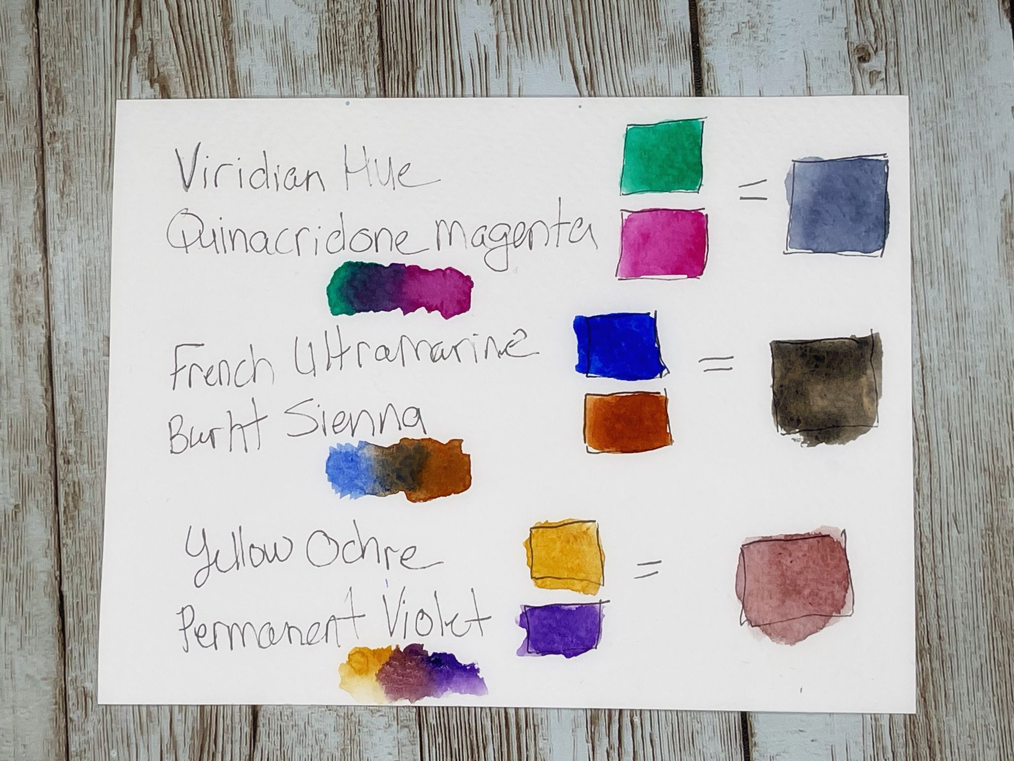
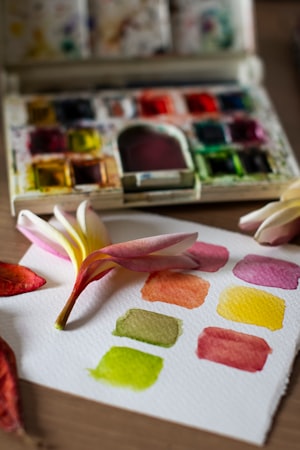
You can see how lovely the colors are when you let them mix on the paper :)
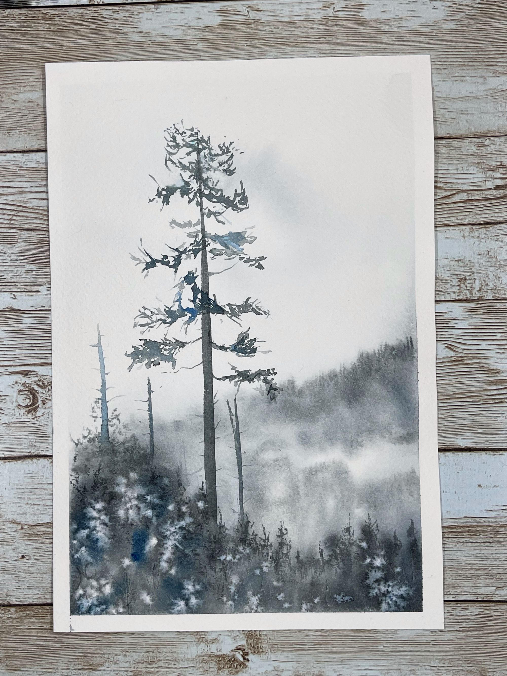
Here is a painting I did making my own grey by mixing complimentary colors.
I used Phthalo Blue Red Shade with Quinacridone Sienna. I liked adding a bit more touches of blue in some areas of interest. What do you think? Have you tried mixing complementary colors before to make your own greys and black? What is your favorite combination?
In conclusion, complementary colors possess an innate visual appeal that can lend harmony and balance to a design. Exploring various contrasting color combinations allows for the discovery of new and intriguing neutral tones. By employing complementary colors effectively, artists and designers can create captivating compositions that leave a lasting impression on viewers.